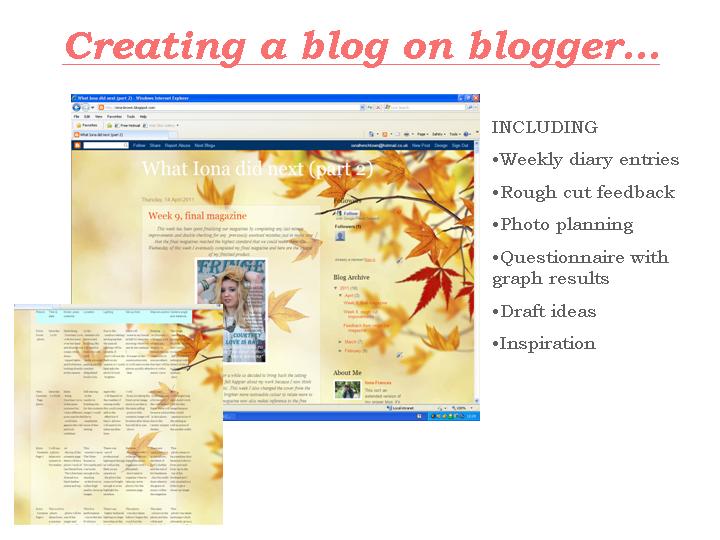
What Iona did next (part 2)
Thursday 5 May 2011
Week 10: Evaluation of my magazine
Thursday 14 April 2011
Week 9, final magazine
This week has been spent finalizing our magazines by completing any last minute improvements and double checking for any previously unoticed mistakes just to make sure that the final magazines reached the highest standard that we could make them.
On Wednesday of this week I eventually completed my final magazine and here are the images of my finished product...
Week 8, rough cut improvements
Once receiving the feedback on our first draft's, this week has consisted of improving our magazine work based on the comments received by our classmates and teachers. I have focused on the improvements suggested and also experimented with enlarging certain photo's and swapping the layout of the images a little, just generally experimenting with what could look better where. Here is a scanned print screen of one of the changes I initially
made to my double page spread...
Although I do like this I, and everybody that I asked, do prefer the original photo of the four combined as it was more unique and resembled a film strip look. I also think that several different images relate more to Courtney Love's character and personality so I will keep that style instead.
Friday 1 April 2011
Feedback from rough cut magazine
Yesterday we studied eachother's magazine rough cuts and provided constructive criticism and praise. It was interesting to witness how different and original my other class member's work was and I gained some very useful and beneficial feedback on my own magazine draft. The comments were over all very positive because a lot of people left nice feedback about the photo's, complimenting such things as the lighting and angles. Here are the main points and improvements made about my front cover, contents page and double page spread...
Front cover
The main conventions that people praised were the magazine name, the fonts, the photo composition and model, the layout and the main image, here is a quote that sums up most positive comments: "The images are very professional and well took, location is also well thought of. The over all layout is very good in terms of the size and style of text and placing of the images. The colour scheme is consistent." During the amendments there was a comment that some text is hard to read which is understandable for the cream coloured text within the featured artists, I will play around with the colours to make the page more legible. It was also suggested that I add a white border to the barcode with numbers along the bottom to make it look more professional and believable, I will definitely improve this to make the front cover better.
Contents page
There was also positive comments on the image location within this page as well as praise on the layout with "good use of various font colours and language" There was reference to the extra images within the contents page being really good so I should ultimately make them bigger. I understand this and will enlarge them because they are also interesting and high quality so if bigger this will also counteract for 'Courtney Love' being the focus on every page and possible make the contents page look less "flat". Somebody also noticed that the "contents page seems to have a different colour scheme" and this is due to pink paint within the main image backgrounds. I did include the gold/ cream colour within some text to relate to the front cover and double page spread more but I will take the comments on board and experiment with some of the text colour.
Double Page Spread
I gained a lot of positive feedback for my double page spread with my target audience liking such things as the text for 'Courtney Love' and the article length/ style. I am very happy with this because the double page spread was the piece that I had put the most thought into and I put a lot of effort into writing the article properly and making it realisticly relate to the musician. Such comments include "Really good montage of images. Well presented quotes and title" With reference to the 'montage of images' I am happy and releived that the four photo's working together as one was well recieved as it is quite an unusual convention for music magazines to have. The only real improvements that I recieved were to add page numbers and branding to the double page spread and contents page and to make the top 2 D.P.S pictures less similar.
I will add the magazine title to the bottom of each page so my work will look more like a magazine and change the second D.P.S image because that's not only similar to the first but it's also a cropped black and white version of the front cover image. I didn't notice this untill now due to changing the original cover so will most definately re-arrange and organize these photo's as no image can be used more than once. I am actually considering enlarging the black and white photo on the first article page to fill the second page instead of the four smaller ones. Although there was a comment saying that the "bottom right photo is brilliant!" so perhaps I could replace the corner image on the first page with that. I will alter a few of these mentioned aspects to see what works and if the original double page spread did look better before then I can always find another image to replace the black and white one.